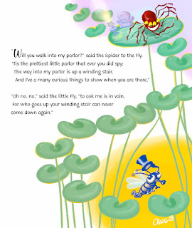
A take on the classic using Affinity Designer.
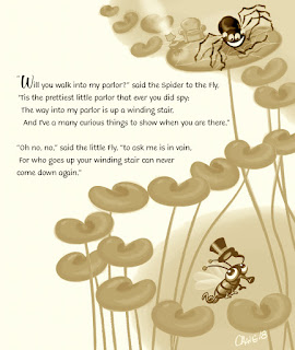
A color version (original) and sepia alternative.
This interpretation was based on a rough done for a book of nursery rhymes.
I liked the comp for its different feel and colors (tho not the original spider).
And then there were some other ideas tried as well.
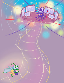
The mushroom stairs comp:
This was closer to the final version that was finally cut from the book.
The modern slant - with tech being the seductive element.


