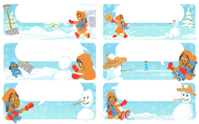
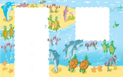
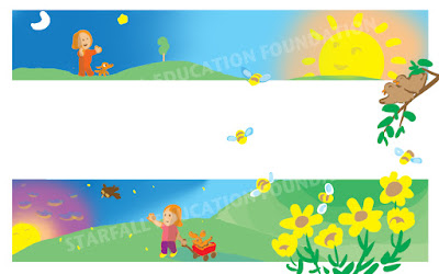
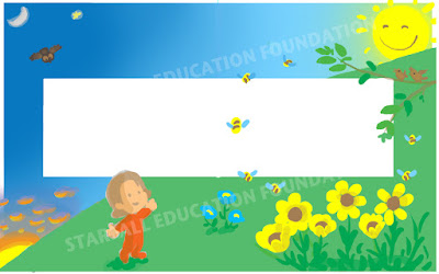
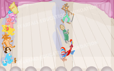
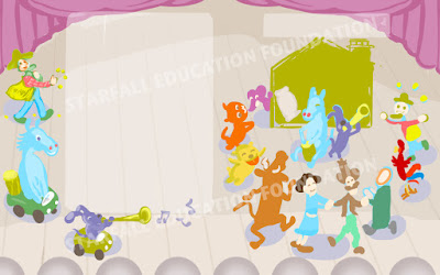
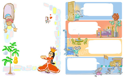
Illustration comps for a Nursery Rhyme book for Starfall Education Foundation.
Many of these served as both layout and color comps. Others use color schemes that deliberately disregard realistic (or cartoon realistic) color choices and as a result are more interesting as art - if not as effective for storytelling.
Each image gave me an opportunity to work with framing text with art.
Setting up dramatic compositions... Staging point and counterpoint.
Working with Photoshop on smaller image sizes forced me to work with shapes and body language and discouraged getting lost in detail.
Some of these comps didn't fly - but are very gratifying to me as little art scenes.
Wording is left to the imagination.
Character design could take directions I was not used to...
I particularly liked the results of building forms with fills - rather than outlines.
I can't take credit for thinking of using the comic book panel-like structure of many of the layouts. That was an idea of Brandi Chase my Producer/Editor at the time. I do enjoy using that form of story/illustration structure very much! Thanks Brandi for opening that door for me.
Final art for print was developed by Dale Beisel. Dales approach to the same imagery was very different from mine. The combination of the two styles (with me poking and prodding the hell out of Dales work) resulted in something very unique. Illustrations of well known and lesser know rhymes - that borrowed very little from standard representation.
Many of the same rhymes are animated to music and song and will be available on Starfall.com.
Lots of very talented artists contributed to the animation! Many thanks to each one of them.


